Plug-in design
To support a native UI/UX, every plug-in should follow Haiilo Home's general design guidelines when it comes to element sizing, typography and coloring.
Sizing
All element sizings, paddings and margins should use an 8px based grid, i.e. they should be divisible by 8. Find more information on the approach in one of these sources:
- The Comprehensive 8pt Grid Guide
- Design System based on the 8pt Grid
- How to create stronger layouts with the 8pt Grid System
One exception to this rule are border radiuses of small components (e.g. buttons), which have a border radius of 4px.
The content of a plug-in should span over the full width of the page without any margins and paddings. While this approach might seem odd when rendered in a standalone viewport, it allows Haiilo Home to set the paddings so that they align with the rest of the system.
Furthermore, every plug-in should take the available screen size (or widget slot size) into account. The width of the iFrame is defined by Haiilo Home grid system and every plug-in can react to changes in width via CSS media queries.
Typography
Sans Serif Pro is used as a default typeface for all text and interface elements. A distinction is made between headings and body text.
Heading
Headings are defined in six different sizes ranging from h1 to h6:
- h1:
600 28px/32px "Source Sans Pro", sans-serif; - h2:
600 24px/28px "Source Sans Pro", sans-serif; - h3:
600 20px/24px "Source Sans Pro", sans-serif; - h4:
600 18px/24px "Source Sans Pro", sans-serif; - h5:
600 15px/20px "Source Sans Pro", sans-serif; - h6:
600 14px/16px "Source Sans Pro", sans-serif;
Text
Body text is defined in five different sizes ranging from xs to xl. The default size is m.
- xl:
400 20px/24px "Source Sans Pro", sans-serif; - l:
400 18px/24px "Source Sans Pro", sans-serif; - m:
400 15px/20px "Source Sans Pro", sans-serif; - s:
400 14px/16px "Source Sans Pro", sans-serif; - xs:
400 12px/16px "Source Sans Pro", sans-serif;
Colors
All of our colors are chosen with accessibility in mind. Basic color combinations are compliant with the WCAG 2.1 AA standards. When using non-standard color combinations, you have to make sure the color contrast is sufficient enough to still comply with these standards.
Neutral (Interface)
Neutral colors are to be used for interface elements. Use n0 as a primary background color.
#ffffff
#f9f9fb
#ebecf0
#d7dbe0
#a8b1ba
#697687
#313d4d
#202d40
#192638
#101d30
Blue (Interaction)
Blue colors are to be used for interactive elements (such as buttons). Use b400 as a primary interaction color.
#ebf5ff
#cce6ff
#73b9ff
#2693ff
#0073e6
#0060bf
Green (Success)
Green colors are to be used to indicate success states.
#f0ffcf
#e2ff94
#c9ed51
#afd62d
#9bbf29
#789c16
Red (Error)
Red colors are to be used to indicate error states.
#ffebe6
#ffbdad
#ff8f73
#ff5531
#dd350d
#bf2600
Icons
Icons are a great way to represent and communicate commands or actions as well as providing visual context within an interface. In certain cases, we leave out labels and use icons solely on their own.
However, actions should always be clear in meaning and consequences, therefore using icons without a label should always be carefully thought through.
@coyoapp/icons
Haiilo Home is publishing its icon set under MIT license via npm. The project contains all icons of Haiilo Home's custom SVG icon set.
Types
As we design for a wide variety of problems and cases, we use two different types of icons: Plain and multicolor icons.

Plain icons are the most common type of icons, used throughout our interface. They are simple, yet bold and leave a lasting impression to convey meaning.
Multicolor icons ****appear in specific cases where we use colors to strengthen their meaning or represent specific products or brands.
Unique use
To ensure an overall consistent design language, it is important to remember that icons can be used in different situations, but should always remain within the same context. This enables people using our products to identify and learn patterns, without getting confused by different meanings and actions connected to specific icons.
Icon grid

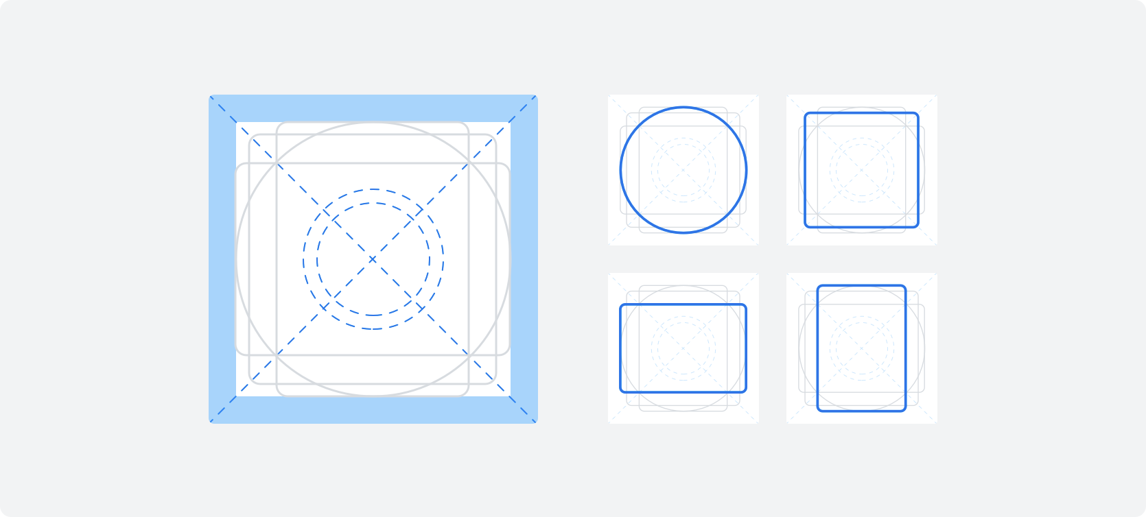
Plain icons are designed on a 20px grid and exported on a 24px artboard. While preparing the artboard it is important to align elements to the pixel grid to ensure pixel-perfect icons and correct scaling.
Sizes
All icons are prepared on a 20x20px grid with at least 2px padding on all sides, resulting in an 24x24px artboard. When implemented by a developer, icons can be scaled to 3 different sizes: small, medium, large.
Style
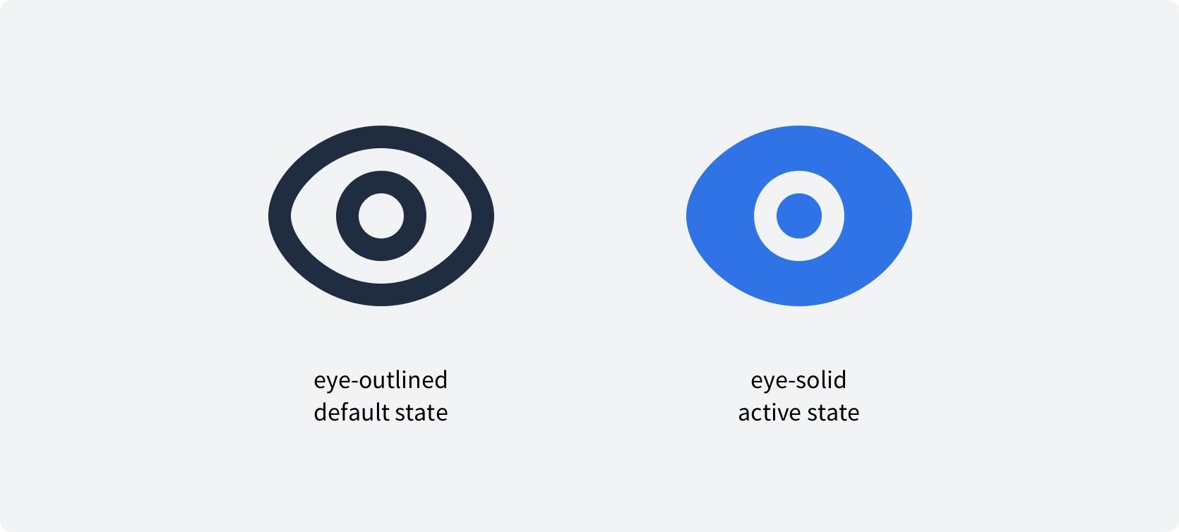
Solid vs. outlined
For plain icons, there are two styles called solid and outlined. These can be used to indicate a state within a component/flow. The outlined variant communicates an action to be made, the solid variant its result. Using these states is a convenient way to communicate progress towards the user.

Borders, stroke caps & radius
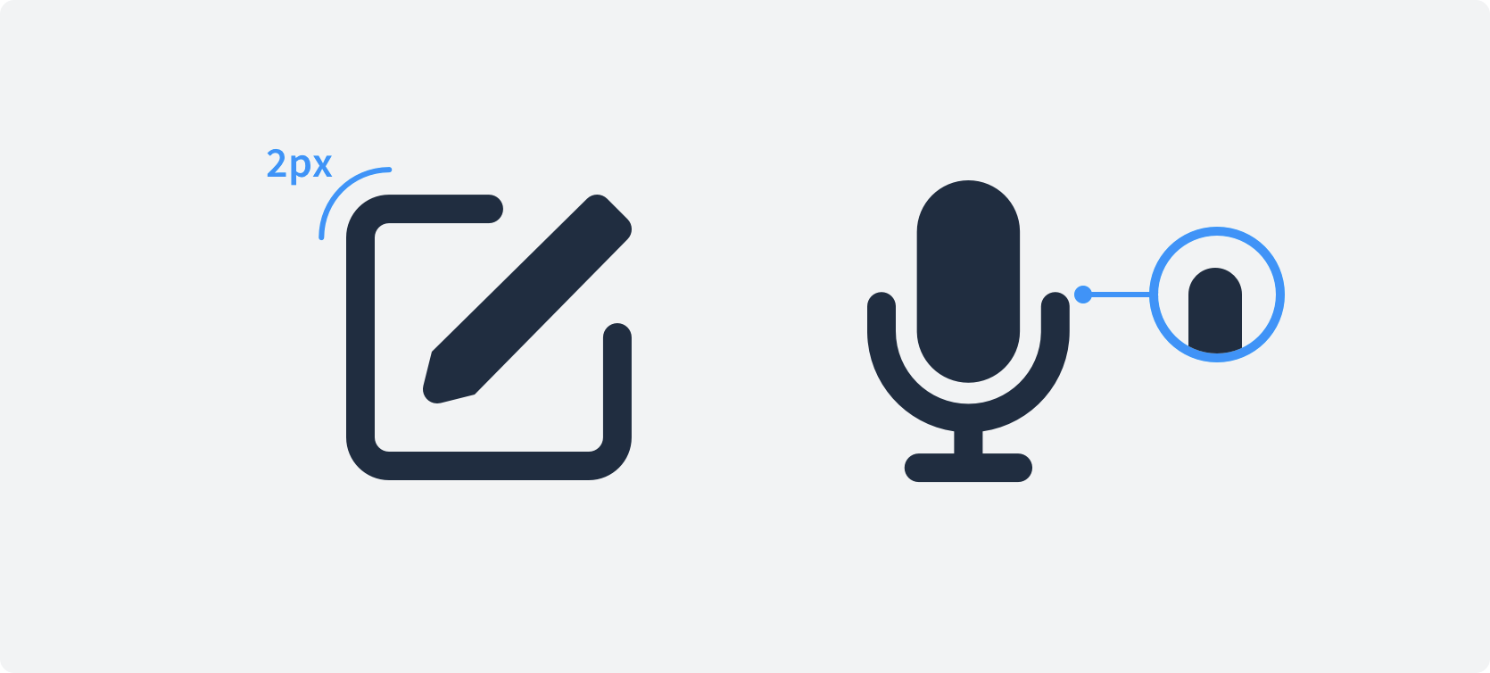
Borders and lines are very important for a consistent look and feel throughout our icon set.
- Always use a 2px thickness for lines and borders.
- Borders and lines use a rounded stroke cap.
- All squares and rectangles must have a 2px radius.
- Irregularly shaped corners must be curved using a 1px radius.

Angles
Icons can be rotated by 45° or 90° degrees if this helps to emphasize the meaning of the shape.

Tonality & UX writing
Thoughtful, consistent interface content is a core element of a well-designed user experience.
Our content guidelines aim to give you clear, tactical suggestions designed to help you use language to craft better experiences.
Use plain language
Writing using plain language doesn’t mean dumbing content down. It’s about making sure language is straightforward and communicates concepts as efficiently as possible.
Tips
- Write short sentences (no more than 15–20 words).
- Use headings and bullets to make your content easier to scan.
- Avoid jargon and always choose a short, simple word over a long and complicated one.
- Only use industry-standard terminology when you have reason to believe it will improve understanding.
- Write for small screens first. Constraints can help you focus on the most important message.
- Read your content out loud. If you get tripped up or it doesn’t sound like something a human would say, your content needs to be edited
Be consistent
To help your audience understand key concepts and actions they can take, use consistent nouns (words used to identify people, places, or things) and verbs (action words) wherever possible.
Tips
- Get in the habit of making a list of all the most important verbs and nouns in the experience you’re building.
- Look at your word list. Does each word clearly describe the object or action it represents in the simplest way possible?
- Identify synonyms (a word or phrase that means exactly or nearly the same as another word or phrase in the same language), and eliminate them. Each important object and action should have a single word to represent it.
Know your surroundings
Give additional guidance by using a contextual coherent language to help your audience maintain a sense of direction and understand more specific concepts and actions.
Tips
- Check if there are already commonly used phrases and words to convey what you want to say
- If the user benefits from adjustments in the choice of words, make sure to keep these changes at a minimum
- Make sure each action is clearly stating what is happening after it is performed
- Make your language fits the situation the user is in and its impact it may have.
Perspective
Our product is build for people, not alongside them. This reflects in writings from the users point of view. An example would be "My files" instead of "Your files". Make sure to always respect the point of view for your interfaces you are developing.
Respect system defaults
You should avoid using wordings which are pre-defined by the system, explaining core functionalities of the main product. This includes labels such as, "Pages", "Communities", or "Events".
Updated almost 2 years ago
